Select and compare/contrast FOUR products by FOUR different contemporary illustrators (e.g...four children's books by different illustrators) - 1200 words.
The techniques and styles of illustrators Sara Fanelli, Nick Sharratt, Aubrey Beardsley and Robert Ingpen are different in almost every way. All four have enjoyed popularity and successful careers in their time, though in terms of choice of subject, media, colour, use of text and many other ways, they have very little in common other than the job title of book illustrator. However, it is their differences that define them and enable publishers to distinguish a suitable audience for their work. Also their ability to portray the narrative in a relatable way, yet remain interesting to the reader. In this way, empathizing with the reader and working to compliment the story are shown to be key traits of a good illustrator.
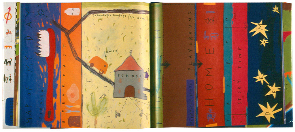
One thing that I feel separates their work is how they depict the narrative according to the age of their target audience. Sara Fanelli is known for her collage, interesting use of text and surreal characters. Fanelli, born 1969, is a contemporary illustrator with a contemporary style. She matches her illustrations with her own text, and books are popular with younger audiences. However, her eclectic imagery would have given a very different impression were she chosen to illustrate classic children’s literature. Walker Publishers did a number of well known children’s books as a series of classic editions, such as The Jungle Book, Alice in Wonderland, Peter Pan, The Secret Garden and others. They used illustrations by Robert Ingpen (born 1937). Ingpen’s look is detailed, pastel-textured and predominately a literal interpretation of the text. In this way, his work compliments the nostalguc and old-fashined fairytales in a way the publishers may have preferred to Fanelli’s work. Aubrey Beardsley, born 1872, is another example of an older illustrator. His work was unsuited to illustrating children’s books, due to his interest in ‘the grotesque, the decadent and the erotic’. However, his work was chosen for Oscar Wilde’s 1893 edition of the play ‘Salome’, a tragedy about John the Baptist. In this way, Beardsley’s macabre look made him ideal for older readers and more gothic writing. Nick Sharratt’s work is also a little surreal, but due to his simple line art style and vibrant pictures used to portray the narrative, his work is ideal for younger readers. He is perhaps unusual in that his work is most associated with teenage and pre-teen author Jacqueline Wilson, but his illustrations would translate into many children/teen age-range books.
Their use of media defines their look as well. Fanelli uses vibrant paint and collage, which makes her art look textured and exciting, unlike many illustrators who favor a ‘flatter’ approach such as pen and pencil. In this way her work is more attractive to younger readers who will appreciate the ‘patchwork’ look. The curvy shapes and vibrant ‘crayon’ colours are common in Nick Sharratt’s work as well. The characters in Sharratt’s work are drawn with more conventionally human proportions and colours, whilst Fanelli’s are surreal. The use of block colour in Sharratt’s art works well in this way, just as the collage effect works with Fanelli’s fantastical style. Ingpen’s drawings have a realistic quality that is also very attractive to children, who would find another world easy to imagine with his illustrations. His choice in media compliments his ‘extraordinary detail. He uses a variety of media, including watercolour, pencil and pastel.’ In comparison, Beardsley’s black and white line art is less attractive to children, but makes the patterns he uses more pronounced. In this way his illustration is more decorative and appropriate for an older age range, as opposed to colour and texture that is common for younger readers.
How the illustrators work with the text is important in the overall look of their work as well. Beardsley uses text very sparsely in his work. His work has been used to illustrate the work of great writers such as Oscar Wilde, new editions of Aristophane’s work and other historical, mythological or philosophical text. For this reason his illustrations are used almost as a backdrop or addition to the text. Whereas in Fanelli’s work, the pictures are the main focus. As a writer and illustrator of children’s books, she is able to use text to her liking in her books. She matches the text to fit around her playful illustrations in a way that makes her work recognizable. Other children’s book illustrators such as Ingpen and Sharratt, whose work is intended to enhance and visualize the narrative, have different things to consider in their work. Ingpen and Sharratt’s characters and the their surroundings correspond literally to the text; where the narrative goes, the illustrations follow, unlike Fanelli’s work. For younger readers, the illustration is the main attraction because they are unable to read. As the child gets older, they focus more on the story and words and begin to understand them on their own. The pictures that once where vital visually become secondary. In his way, Fanelli can be sparing with her text because she is predominately drawing picture books for children. Ingpen’s illustrations are large scale and detailed because they are aimed at children who still enjoy the illustrations most, but also are beginning to understand a more complex narrative. Sharratt’s work serves only to decorate and flourish the fictional story he has to work with, in his work for Jacqueline Wilson especially. This suits because her readers are pre-teen to teenage age and the majority of her books are aimed at a female audience. Beardsley’s work is wholly decorative and can afford to be conceptual because he illustrates writing for adults.
Something that all the illustrators would need to take into account for their career is the context in which they were working. Fashion and developments in society are powerful influences over artists. Beardsley’s controversial themes of eroticism, mythology and satire identified him as an adult illustrator, and he presented these themes through a very ‘art nouveau’ medium. Art nouveau was most popular in England toward the end of Beardsley’s life. Therefore his work was popular in that it was fashionable, but also unique enough that he stood out, and he is remembered as a pioneer of the art nouveau movement in the 20th century. Ingpen has worked throughout the late 20th century, and although his style has been mainly unaltered in this time his work is classic realism. His nostalgic use of traditional, almost old-fashioned media in modern edition books are reminiscent of the style popular in the past. Book with his work will appeal to parents buying their children books who admire artist techniques and classic stories, and who are struck by the beauty and detail of his work. Fanelli and Sharratt are both contemporary illustrators. Unlike Ingpen and his classic editions, they are llustrators hoping to sell original work like so many others on the shelf. In our modern world, those who can capture interest fast, and then hold it, will gain momentum for their work. The primary colours and mad, cartoon characters are eye-catching and appeal to parents looking for an attractive and bright book that will entertain their child for five minutes, or older children looking for an exciting book to distract them from homework and the mundaneness of growing up. In this way, Sharratt and Fanelli’s work is carefully atuned to the context in which they are trying to sell their product.
Illustrators like successful illustrators such as Sara Fanelli, Robert Ingpen, Aubrey Beardsley and Nick Sharratt deploy a tactical empathy with their readers. They can be observed and compared by the media, colours, target audience, choice of publications, context of their work being on the market and other factors. From doing this more can be understood about the task of matching a narrative with the most suitable illustrator.
Word count: 1297 (sorry Steve!)
Wow, that took me sooooo long. Then my Pages document died and I thought I'd lost it -.- I'm too ill for this stress. Ahaha